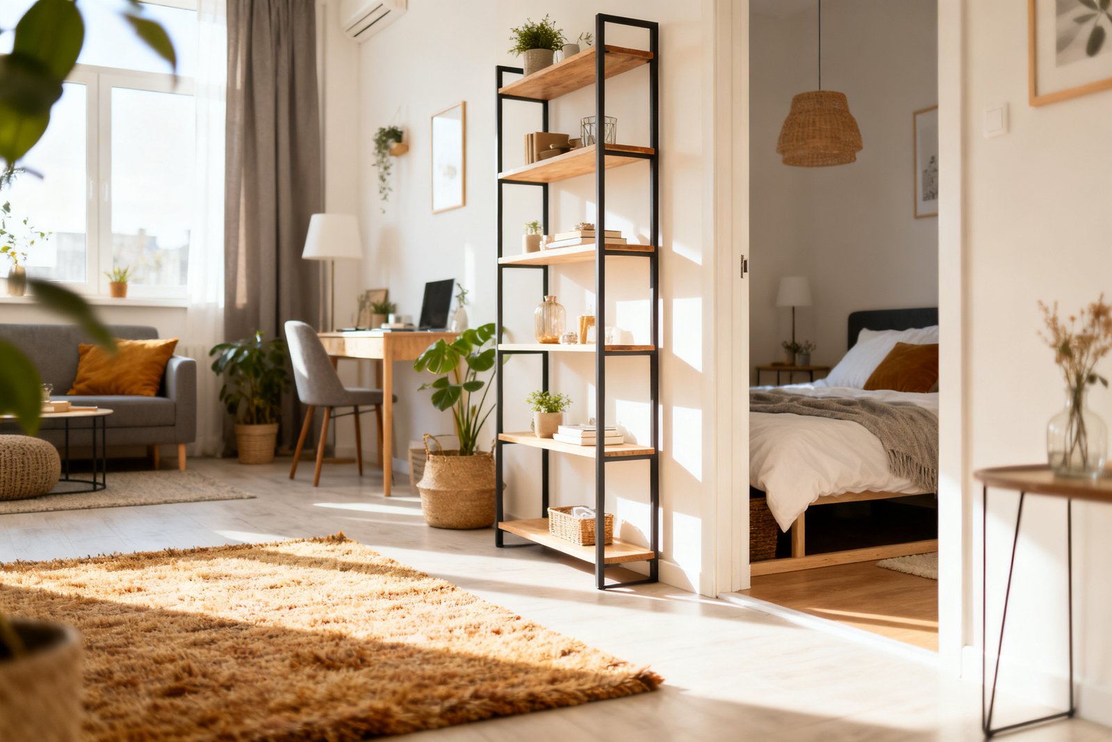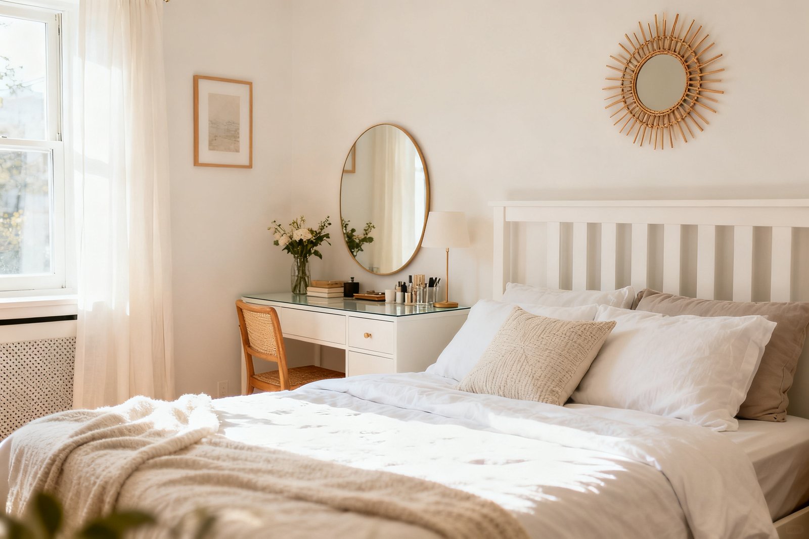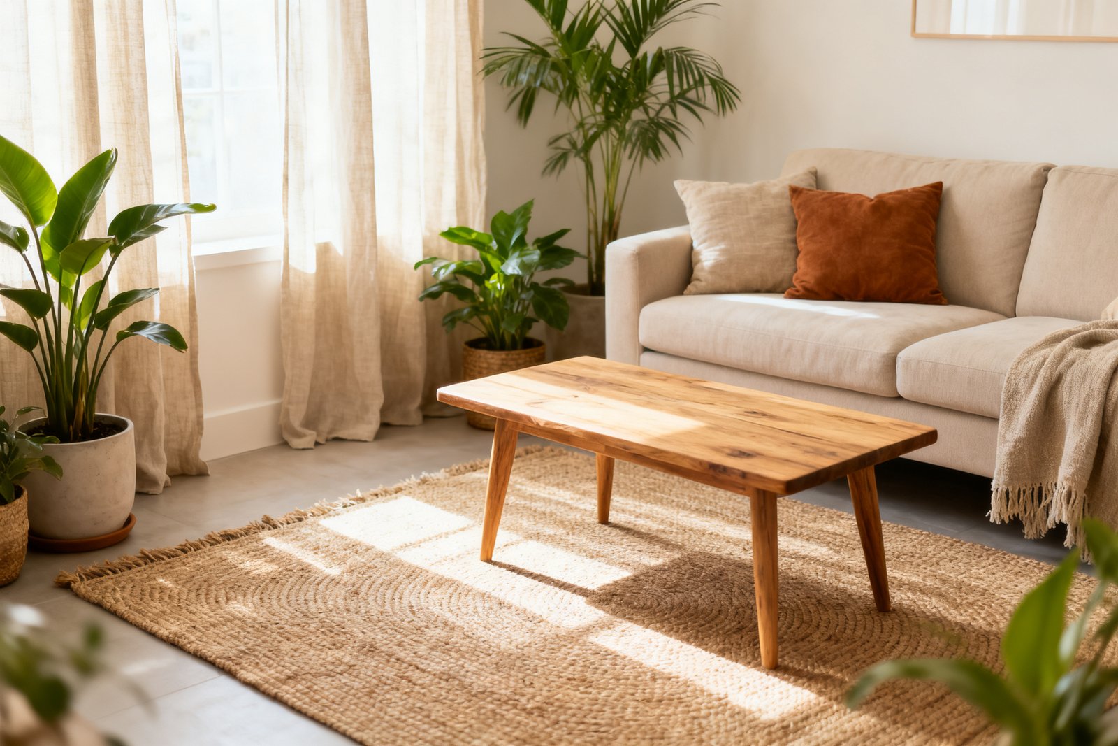

A cohesive color palette makes your home feel intentional, calm, and easy to decorate—without buying new furniture for every room. With a few smart choices and repeatable rules, you can stretch a small budget and tie spaces together, even if your rooms have different functions and lighting.
Below, you’ll find a practical, step-by-step way to choose colors, test them, and roll them out across your entire home—plus budget tips, a realistic example, and common mistakes to avoid.
Start With What You Already Own
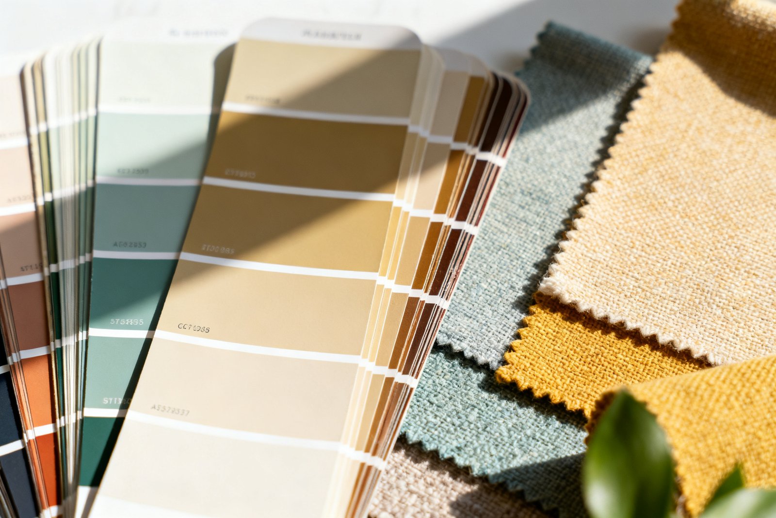
Build your palette around the fixed elements you can’t or don’t want to change: flooring, large furniture, countertops, built-ins, and existing tile. These surfaces already set undertones and temperature (warm vs. cool) that should guide your choices.
Gather fabric swatches, a cabinet door, a floor sample, or clear photos printed in natural light. Lay them together on a white poster board so you can see undertones side by side. If your sofa leans warm beige and your floors are honey oak, a cool gray might clash, while a warm greige will blend.
Budget tip: If you don’t have swatches, take well-lit phone photos and print them on matte paper at a copy shop ($1–$3). Keep them in a folder for paint store visits.
Build a Simple Whole-Home Palette
For more ideas, see our guide on how to choose paint colors on a budget.
A whole-home palette doesn’t have to be complicated. Aim for a primary neutral, a secondary neutral, two accent colors, and an optional deep anchor. That’s usually enough to create variety without chaos.
Core components
- Main neutral (walls in most spaces): light to mid-tone white, off-white, greige, or soft beige.
- Secondary neutral (trim, doors, or a few rooms): slightly lighter or darker than your main neutral, or a clean white for contrast.
- Two accents (for decor, textiles, smaller rooms): repeatable colors pulled from art or rugs.
- Deep anchor (optional): a saturated or dark tone for a powder room, built-ins, or a dramatic accent.
Keep the palette tight by choosing colors with compatible undertones. If your floors and large pieces read warm, pick neutrals with a hint of warmth (cream, greige with beige notes). If your fixed elements are cool (gray tile, charcoal sofa), lean into cooler neutrals (soft gray, crisp white) and cool-toned accents.
Undertone check
Hold your paint chips against a pure white sheet and a warm beige sheet. Does the chip look pink, yellow, green, or purple by comparison? That’s the undertone. Match undertones across your selections to avoid surprises on the wall.
Create Flow Room to Room
Once you've picked your palette, put it to work with our free 5-Day Budget Home Reset—five days of easy, low-cost updates.
Once you have the palette, decide how it travels through the house. Repetition is your friend: use the same main neutral in all hallways and shared spaces, then vary accents by room while keeping the base consistent.
Simple flow formula
- Use the main neutral for 60–70% of wall surfaces (entry, halls, living spaces).
- Repeat the trim color everywhere for consistency (baseboards, doors, window trim).
- Pick one accent to repeat at least three times per floor (pillows, throws, lampshades, art mats, or one painted piece of furniture).
- Reserve the deep anchor for small or feature spaces (powder room, built-ins, inside a bookcase, an accent door).
Budget tip: You don’t have to repaint whole rooms. Repeating an accent through textiles ($10–$40 per pillow cover), lamp shades ($15–$30), or a thrifted side table painted in your accent color ($8–$20 for a sample pot + primer) can visually connect rooms.
Test Colors the Right Way
It also helps to check out mix and match patterns.
Paint looks different on walls than on chips. Always test before you commit, especially for your main neutral and deep colors.
How to sample smart
- Buy peel-and-stick samples ($2–$5 each) or sample pots ($4–$8). Stick or paint at least two 12×12 swatches on different walls in the same room.
- Check at morning, midday, and evening. North-facing rooms run cooler and dimmer; south-facing rooms can warm and yellow colors.
- Place samples next to your trim and flooring to see undertone interaction. Avoid testing over existing strong colors without a white primer patch—they skew perception.
Budget tip: If sample pots feel wasteful, paint them on primed foam boards ($2–$4 each). You can move boards from room to room and reuse them.
Assign Finishes and Sheens
Keeping sheens consistent also adds cohesion. It affects color perception and durability, and smart choices save money on touch-ups.
- Walls: eggshell or washable matte (hides imperfections, easy to clean). Many budget lines offer scrubbable matte at $25–$40/gal.
- Trim and doors: semi-gloss or satin (more durable and distinct from walls). Plan on $30–$50/gal for decent coverage.
- Ceilings: flat (minimizes glare). Usually fine in the most affordable range ($15–$25/gal).
Using the same finish throughout reduces guesswork and leftover odds and ends. If you change finishes, keep notes on brand, color, and sheen for easy future touch-ups.
Stretch Your Budget with Strategic Paint
You don’t have to repaint everything at once. Create the biggest impact for the least cost by targeting sightlines and high-traffic zones first.
Priority order
- Entry and connecting halls: set the tone and unify transitions (1–2 gallons typically $25–$80 total with a budget brand).
- Main living area: defines the overall vibe (2–3 gallons $50–$120).
- Trim and doors: one color throughout modernizes fast (1–2 gallons $30–$100; consider sanding blocks and a bonding primer $10–$20).
- Feature space with deep anchor: powder room or built-ins (1 gallon $25–$50; small space, big payoff).
Budget tip: Ask paint stores for mis-tints—pre-mixed paints other customers returned—often $5–$15/gal. You may find a perfect accent or closet color from your palette family.
Use Decor to Tie Colors Together
Paint isn’t the only tool. Soft goods and accessories are affordable ways to repeat your palette and make rooms feel related.
- Textiles: pillow covers, throws, curtains, and rugs in your accent colors. Pillow covers are $8–$20 online; thrift stores often have washable throws for $5–$10.
- Art: unify mismatched frames with one frame color (spray paint $6–$10). Use mats in your secondary neutral to echo trim.
- Lighting: swap yellowed shades for linen-look white or your accent hue ($12–$30). Warm LED bulbs (2700–3000K) soften cool palettes; neutral LEDs (3000–3500K) balance warm tones.
- Furniture refresh: paint a thrifted console or bookcase in your deep anchor to reinforce the palette.
Realistic Example: Cozy Warm Neutrals with Blue-Green Accents
Suppose your home has honey oak floors, a beige sectional, and white appliances.
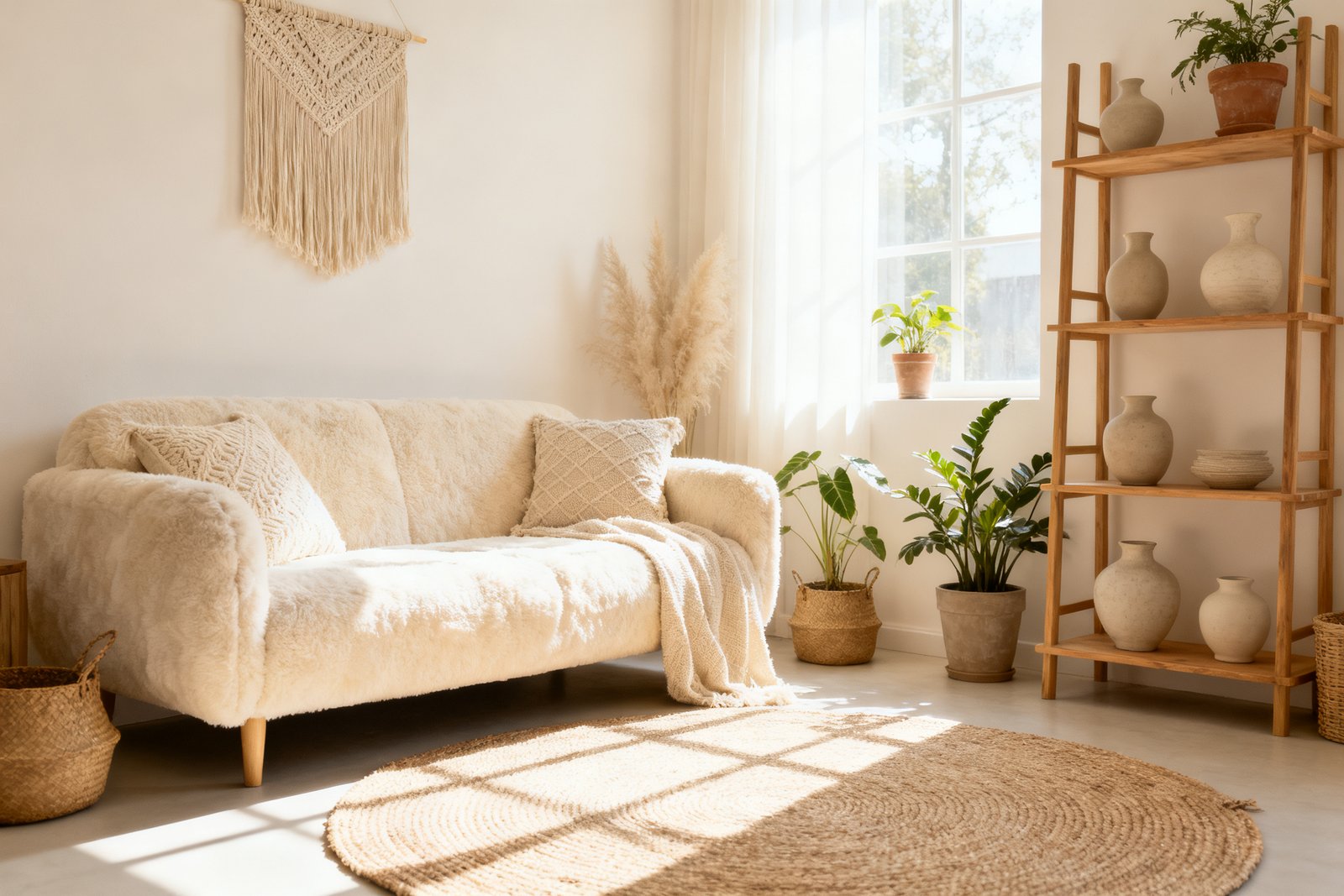
- Main neutral: warm greige on most walls (entry, hall, living, dining).
- Trim and doors: soft creamy white throughout.
- Accents: muted slate blue and soft sage (found in a vintage rug and a piece of art).
- Deep anchor: deep teal for the powder room and inside the living room built-ins.
Execution: Paint the entry and hall in the warm greige (2 gallons, $50–$80). Swap living room pillows for slate blue covers ($30 for three) and add a sage throw ($12). Spray-paint thrifted frames creamy white ($8) and mat two prints with off-white mats ($10). Paint the powder room teal (1 gallon, $25–$40) and pick a simple white shower curtain ($15) to keep it crisp. Repeat teal on a small side table ($10 sample pot + $8 primer).
Total spend for phase one: roughly $150–$250. The palette feels deliberate, and you can add pieces over time without guessing.
Checklist: Build and Roll Out Your Palette
- Audit fixed elements (floors, counters, big furniture) and note warm/cool undertones.
- Collect swatches and select: 1 main neutral, 1 trim/secondary neutral, 2 accents, 1 deep anchor (optional).
- Sample main and anchor colors in multiple rooms and light conditions.
- Decide a flow: where the main neutral goes, which rooms get accents, where to use the anchor.
- Choose consistent sheens: walls (eggshell/matte), trim (semi-gloss/satin), ceilings (flat).
- Start with entry and halls, then main living, then trim/doors, then a feature space.
- Echo accents 3+ times per floor with textiles, art, or one painted furniture piece.
- Document brand, color codes, and sheen for each surface for future touch-ups.
Mistakes to Avoid
- Skipping samples: small chips lie; wall tests save money and time.
- Too many statement colors: more than two main accents can look busy fast.
- Mismatched undertones: cool gray with orange oak often clashes—choose warmer grays/greiges instead.
- Changing trim colors room by room: inconsistent trim breaks flow.
- Ignoring lighting: the same color can look dingy in a north room and yellow in a south room; adjust depth and warmth as needed.
- Painting everything white without checking warmth: some whites turn stark blue or yellow depending on light and surroundings.
FAQ
How many colors should I use in my whole-home palette?
Five to six is usually enough: one main neutral, one trim/secondary neutral, two accents, and an optional deep anchor. You’ll create variety through placement, materials, and pattern rather than adding more hues.
What if I love bold colors—can I still have cohesion?
Yes. Keep your main neutral consistent and use bold colors in smaller doses: a powder room, an accent door, or built-ins. Repeat a thread of the bold hue in textiles or art in adjacent spaces so it feels connected, not random.
Do open-concept spaces need one wall color?
Not necessarily, but using one main neutral across the whole area reduces visual chop. Add interest with a deeper shade on a single feature (like the kitchen island or a back accent wall) and pull accent colors through fabrics and decor instead of changing wall colors abruptly.
How do I choose a white that won’t look yellow or blue?
Test three whites: one warm, one neutral, one cool, next to your trim and flooring. In warm homes (oak, beige), a soft warm white usually looks clean without going yellow; in cool homes (gray tile, black accents), a neutral-to-cool white can read crisp without blue. Always sample in your lighting before deciding.
If you want to keep going, take a look at best paint finishes guide.
Final Thoughts
A cohesive palette comes from a few intentional choices repeated throughout your home. Start with your fixed elements, pick a small, compatible set of colors, and roll them out in phases, testing as you go. With strategic paint, consistent trim, and budget-friendly accents, you’ll get a pulled-together look that feels natural—and works room to room—without overspending.