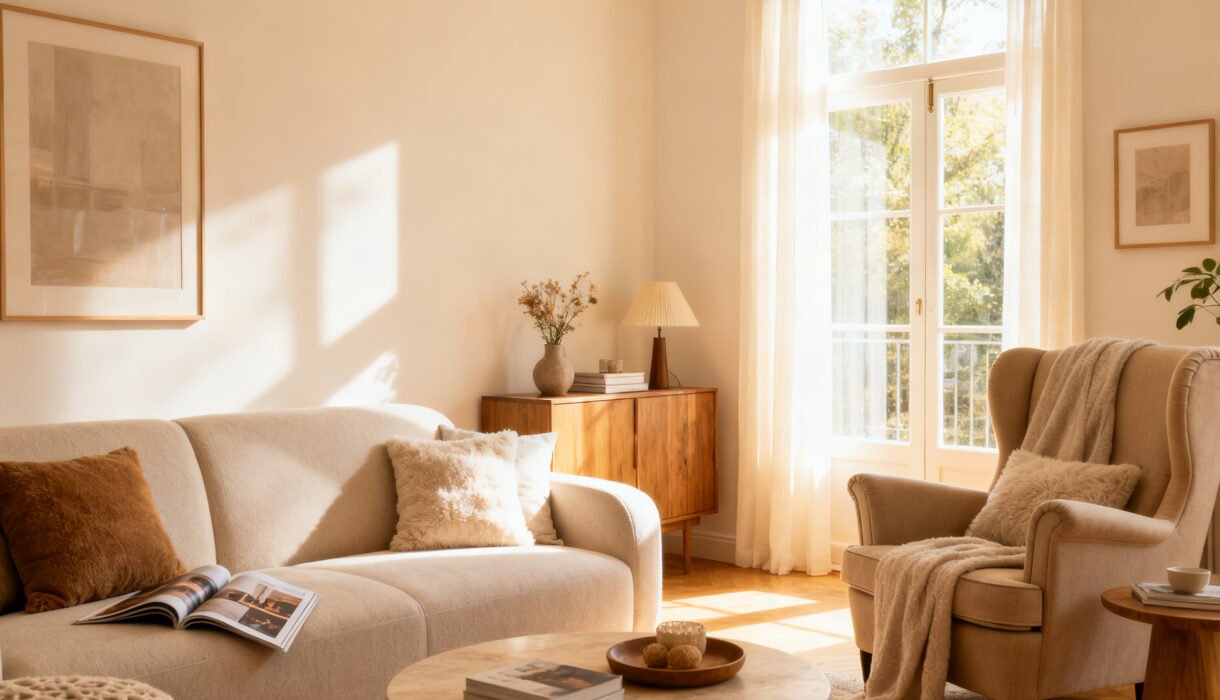

You don’t need a designer, a trust fund, or a 47-shade fan deck to nail the perfect paint color. You need a plan, a few cheap tools, and the courage to say “no” to the fourth gray that looks exactly like the first three. Let’s get you to a room that looks intentional, not accidental, without emptying your wallet.
Ready to pick colors you’ll actually love living with?
Start With What You Already Own
You probably don’t need a brand-new palette—you need to listen to your room. Look at your biggest elements first: the sofa, rug, flooring, curtains, or that dramatic art print you impulse-bought. These pieces already set your color boundaries. Pick one “boss” color and one “supporting” color from your stuff. If your rug has navy, rust, and cream, choose navy for the walls or trim and save rust for accents.
Pulling from existing tones makes your space feel pulled together on the cheap.
Quick Color Hunt
– Snap a photo of the room in daylight. – Use a free color picker app to sample two or three shades from the photo. – Grab matching paint chips at the store based on those samples. Close enough counts—your eyes do the final edit.
Find Your Finish Line: What Mood Do You Want?
Paint color lives or dies by mood. Cozy cave?
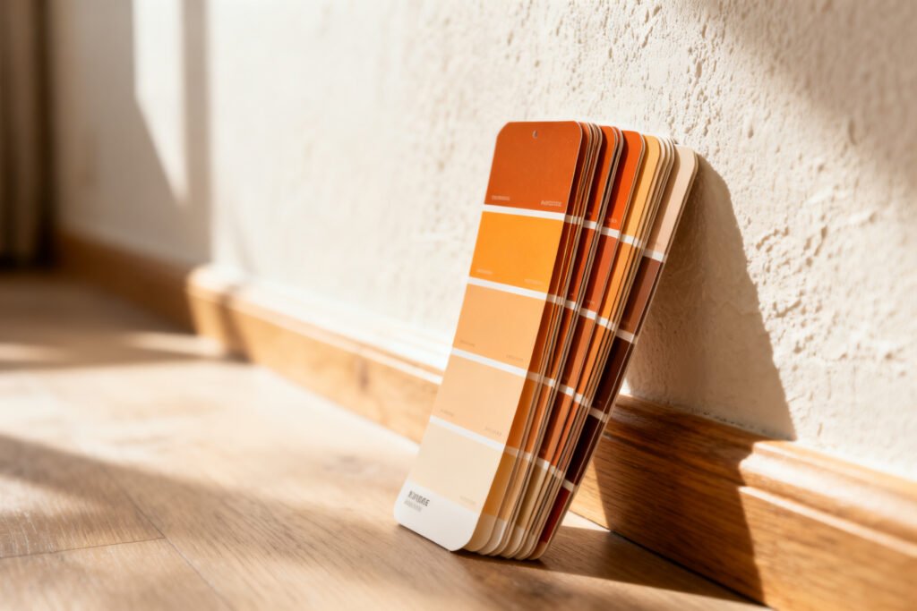
Bright gallery? Spa day? Decide the vibe first. If you skip this, you’ll drift between options forever and eat 14 sample fees. – For calm, pick muted, mid-tone colors (sage, dusty blue, warm greige). – For energy, try fresh, clean hues (buttercream, light coral, modern teal). – For drama, go darker or more saturated (ink blue, olive, charcoal).
Budget Mood Hack
You don’t need designer brands. Ask the store to color-match a premium shade into a budget line.
Results look almost identical, and your wallet lives to see another weekend.
Test Like a Pro (Without Buying 12 Sample Pots)
You can test well with just 2-3 samples if you do it right. Always test on poster boards, not straight on your walls. That way, you can move the samples around and avoid repainting your test patches. – Paint two coats on large white poster boards. Label them, or you’ll forget which is which—ask me how I know. – Move boards around the room morning, afternoon, and night. Colors shift with light, and yes, it matters. – Look next to your existing finishes (tile, counters, floors).
Some grays turn purple next to yellowy oak. It’s not the paint’s fault—it’s the combo.
Don’t Skip Sheen
The same color can look different in different sheens. – Matte/Flat: Hides wall sins, scuffs easier. Great for low-traffic rooms. – Eggshell/Satin: Soft glow, easier to clean.
Perfect for living rooms and bedrooms. – Semi-gloss/Gloss: Durable and reflective. Use sparingly on trim/doors for contrast. FYI: If your walls look bumpy, stick with matte or eggshell.
Gloss will rat you out.
Use the 60-30-10 Rule (But Don’t Treat It Like Law)
You don’t need a design degree—just a simple ratio. 60% main color, 30% secondary, 10% accent. This keeps things balanced without math headaches. – 60% walls – 30% furniture/curtains/rugs – 10% art/pillows/lamps Want to flip the script? Paint the walls a soft neutral and let your furniture or rug carry the color. IMO, that’s the cheapest way to look “curated” fast.
Accent Walls: Friend or Foe?
Accent walls still work if you use them with intention. – Choose a wall that frames something (bed, fireplace, bookcase). – Go one or two shades darker than the main walls, not a random outlier. – If the room feels small, skip high-contrast accents.
Try a tone-on-tone accent instead.
Master the Undertone Game (So You Don’t End Up with Neon Beige)
Undertones make or break budget paint. Warm vs. cool matters, and so does your lighting. – Warm undertones: yellow, red, peach. Cozy and forgiving. – Cool undertones: blue, green, violet. Crisp and modern.
Now the kicker: lighting. – North light reads cool—warms colors up or your walls might look icy. – South light reads warm—cool colors balance it nicely. – East morning light = fresh; west afternoon light = golden. Test both. If your floors skew orange (hello, honey oak), avoid grays with blue undertones unless you want a surprise purple effect.
Try greige or taupe instead. Trust me here.
Save Money With Smart Paint Choices
Paint adds up fast. Here’s how to cut costs without cutting corners: – Limit color count. Use one wall color for multiple rooms and vary the feel with textiles and art. – Buy during sales. Major stores run promos around holidays—stack coupons. – Prime strategically. If you go from dark to light (or vice versa), use a tinted primer matched close to your final color.
You’ll need fewer coats. – Roll better, not more. A quality roller cover gives smoother results and can save you a coat. – Use sample pots as accents. Paint picture frames, shelves, or the inside of a bookcase with leftover samples. Cute and basically free.
Small Room? Don’t Fear Color
People say small rooms need white.
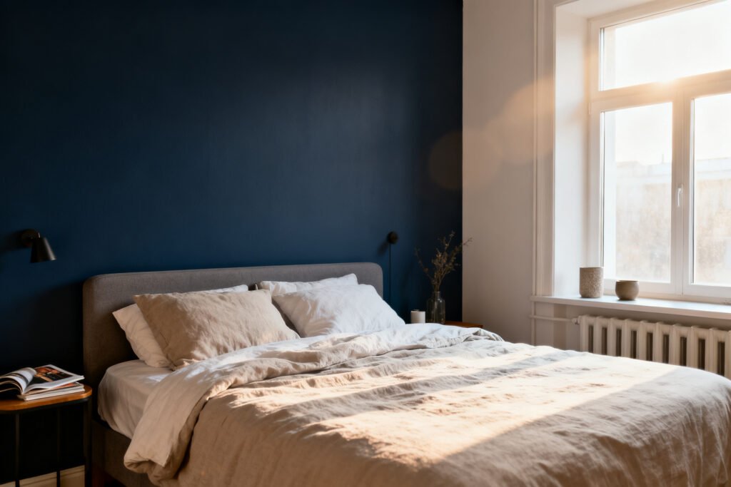
They don’t. Darker colors can make small rooms feel intentional and cozy. Pair with light bedding, mirrors, and a pale ceiling to keep it comfy, not cave-y.
Color choices feel clearer in a calm, uncluttered room. The free 5-Day Budget Home Reset gives you a five-day head start before you pick a palette.
Trim, Ceiling, and Doors: Your Secret Weapons
If your room feels “meh,” upgrade the frame. Trim, doors, and ceilings change everything. – Trim: Crisp white brightens any wall color. Or try soft beige or greige for a chic, less-contrast look. – Doors: Paint interior doors charcoal, deep green, or black for instant polish. – Ceiling: Go a half-shade lighter than the walls to create a seamless, taller feel. Low ceilings?
Avoid dark ceilings unless you want drama.
Two-Color Trim Trick
Paint baseboards and doors a deeper neutral (like warm gray) and keep window trim soft white. It looks custom, especially in older homes, and costs pennies more.
Color Shortcuts That Rarely Fail
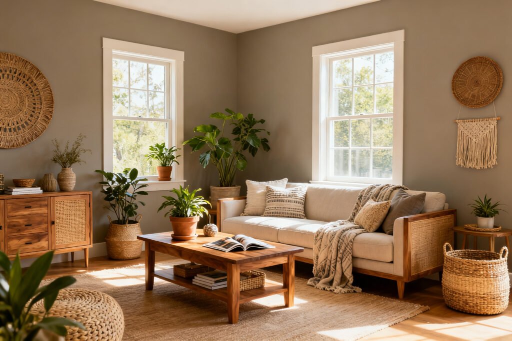
When in doubt, these combos rarely disappoint: – Warm neutral walls + navy accents + brass hardware = cozy classic. – Soft greige walls + black doors + linen textures = modern and calm. – Sage green walls + natural wood + matte black = fresh yet grounded. – Off-white walls + warm wood + dusty blue textiles = airy but not sterile. IMO, pick one metal finish (black, brass, nickel) and commit across fixtures and frames.
It glues the look together for cheap.
FAQ
How many paint samples should I buy?
Two to four samples usually do the job. Pick one safe option, one slightly bolder option, and one wild card. Test them on poster boards and look at them in different lighting before deciding.
Do I need primer every time?
Not always.
If you’re painting a similar shade, a paint-and-primer combo works. If you’re changing from dark to light (or light to dark), covering stains, or painting raw drywall, use a dedicated primer—ideally tinted toward your final color.
What’s the most budget-friendly color strategy for a whole home?
Choose one main neutral for most walls, one darker tone for cozy rooms or accents, and one fun accent color you repeat in small doses. Keep trim consistent across the home.
This creates flow without buying eight gallons in five different hues.
For more ways to elevate a room for less, explore make your home look expensive on a budget, a cozy minimalist aesthetic, and budget wall styling ideas.
How do I make sure the color works with my floors?
Identify your floor undertone first—yellow/orange (warm wood), pink (some tiles), or cool gray. Then test samples directly next to the floor. If the combo makes either surface look strange (pinkish, greenish, muddy), switch undertones.
What if I’m renting and can’t go wild?
Pick a renter-friendly neutral for walls and punch up color in art, pillows, lamps, and low-commitment pieces.
You can also paint furniture, frames, or peel-and-stick panels with sample pots. Landlords love neutral walls; you can love everything else.
Why does my gray paint look blue/purple/green on the wall?
Grays hide undertones, and lighting or nearby finishes pull them out. If your gray turns blue, it probably has a cool base.
Try a warmer greige with a touch of beige or brown to neutralize it.
Conclusion
Great paint choices don’t come from luck—they come from testing smart, honoring your room’s finishes, and picking a mood before you pick a chip. Keep your color count tight, your undertones honest, and your sheen sensible. Do that, and you’ll get a space that looks designer on a discount—no drama, just compliments.
Now grab a roller and make some magic.
Planning paint as part of a bigger bedroom refresh? The The Budget Bedroom Makeover Planner walks you through the whole makeover, budget included.