You don’t need a trust fund to have fabulous shelves. You just need a plan, a dash of creativity, and maybe a free afternoon. Let’s turn that chaotic ledge into a stylish moment without melting your wallet.
1. Shop Your Home Like a Thrift Store
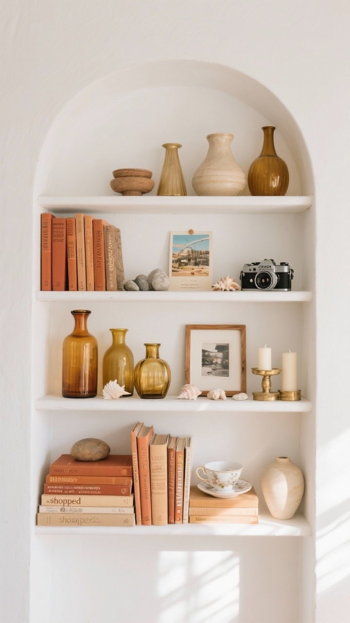
Before you spend a dime, raid your own stuff. You’ve got more display-worthy pieces than you think—just hiding in drawers and closets. Grab books, bowls, frames, vases, candles, random trinkets, and those souvenirs you swore you’d display someday.
What To Pull
- Books: Hardcovers, cookbooks, even old textbooks if the spine color works.
- Glass & ceramics: Mismatched vases, bowls, and jars feel curated, not chaotic.
- Frames: Mix sizes; fill with postcards, fabric scraps, or printed photos.
- Nature: Seashells, stones, branches—free and chic, FYI.
- Sentimental pieces: Vintage cameras, heirloom cups, travel finds—instant personality.
Pro tip: Stick to a loose color palette pulled from what you already own. If your stuff skews warm (terracotta, brass, wood), lean in. It keeps a budget look cohesive.
2. Create Visual Rhythm With Height, Weight, and Space
Good shelves aren’t crowded; they’re composed. Think like a DJ—mix highs, lows, and silence. The magic lives in the negative space.
The Rhythm Rules
- Triangle styling: Arrange items in invisible triangles (tall, medium, small) across each shelf and the whole unit.
- Odd numbers: Group in 3s or 5s. It’s an interior design cheat code.
- Vary weights: Pair a chunky sculpture with a light, airy vase. Contrast is your friend.
- Leave breathing room: Empty space = intentional, not incomplete.
Step back every few minutes. If something looks heavy, balance it across from a lighter moment. Easy fix, big payoff.
3. Stack, Layer, and Hack Your Height
Short items get lost on shelves. Don’t toss them—elevate them. Literally. Stacks and risers make humble pieces look important.
Height-On-A-Dime Ideas
- Book stacks: Flip a few books horizontally to lift a candle, a bowl, or a plant.
- DIY risers: Use wood offcuts, boxes wrapped in fabric, or a small inverted bowl under an object.
- Layered frames: Lean a larger frame behind a smaller one for depth; no need to hang.
- Plate stands: Prop a decorative plate or vinyl record for vertical interest.
Hot tip: Strip dust jackets off books for chic, linen-textured spines. If colors clash, turn them around for neutral paper edges (controversial, but your shelf, your rules).
4. Mix Materials For Texture (Not Price)
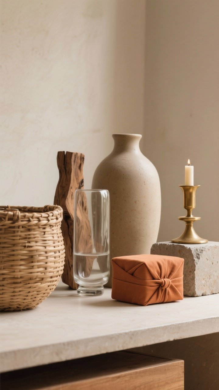
Texture is what makes shelves feel rich. You don’t need designer pieces—just a mix of finishes that play nicely together.
Texture Combos That Always Work
- Matte + Gloss: Unglazed ceramics with shiny glass or glazed pottery.
- Natural + Metallic: Woven baskets or wood paired with brass, copper, or chrome accents.
- Soft + Hard: A small fabric-wrapped box next to stone or concrete.
Budget sources: Thrift stores, dollar stores, and your recycling bin (hello, cute jars). A $3 brass candlestick next to a $1 terracotta pot looks high-end when styled right.
5. DIY Art and Objects (That Don’t Look DIY)
Custom pieces make shelves feel curated—without the gallery price tag. Keep it simple and sculptural.
Easy Projects That Look Luxe
- Painted thrift frames: Unified color = expensive vibes. Try matte black, cream, or soft sage.
- Printable art: Download museum prints or vintage botanical illustrations and print at home.
- Book covers: Wrap old novels in kraft paper or fabric; label spines with a fine pen.
- Clay shapes: Air-dry clay = instant sculptural objects (arches, spheres, beads for garlands).
- Textural vessels: Rub baking soda into acrylic paint and brush over glass jars for a ceramic look.
BTW: One or two handmade pieces per shelf is plenty. Sprinkle, don’t smother.
6. Style With A Theme—But Keep It Chill
A theme whispers “intentional,” not “Pinterest cosplay.” Choose a vibe, then interpret lightly so it feels collected, not costume-y.
Low-Cost Themes To Try
- Monochrome Moment: Stick to black, white, and one accent color. Super cohesive, super forgiving.
- Organic & Earthy: Wood, linen, clay, dried stems. Use baskets to hide clutter.
- Travel Stories: Stack guidebooks, display tickets in frames, add a tiny globe or map print.
- Modern Vintage: Pair clean-lined frames with thrifted brass and old cameras or books.
Keep it real: If you love color, use it—just repeat it 3+ times across the shelves so it reads intentional. Bright teal vase? Add a teal book spine and a print with teal accents, and boom—cohesion.
7. Edit Ruthlessly and Maintain Like a Minimalist
The secret to expensive-looking shelves? Editing. Even budget pieces look luxe when they’re not crammed together. Take everything off, add back in layers, and stop before it feels full.
Your Edit Checklist
- Remove duplicates: If you have three similar vases, keep the best one.
- Balance color: Repeat each color at least twice across the whole unit.
- Check heights: Aim for a gentle skyline—no one awkward skyscraper.
- Texture count: Ensure every shelf has at least two textures (like glass + wood).
- Negative space: Leave gaps. It signals confidence and intention, IMO.
Maintenance mode: Dust weekly (a quick swipe), swap a piece seasonally, and rotate in fresh greenery. A tiny tweak keeps everything feeling new without redoing the whole thing.
Quick Budget Sources:
- Thrift stores and yard sales for frames, bowls, and brass.
- Dollar stores for candles, glass cylinders, and faux stems to mix with real ones.
- Craft stores for air-dry clay, baking soda paint trick supplies, and affordable baskets.
- Your backyard for branches, stones, and leaves—free and fabulous.
You’ve got this. With a little editing and a few clever hacks, your shelves will look like you spent a fortune—when really, you just spent the afternoon. Now light a candle, snap a pic, and accept the compliments that are about to roll in.