
I’ve seen more TV stands dressed like a cluttered museum than a polished, expensive setup. The good news: you don’t need a designer’s budget or a magic wand. You just need a plan, a tiny bit of restraint, and a few style-smart moves. Let’s get your TV stand looking clean, cohesive, and somehow upscale without the pretentious vibes.
Start with a clean slate: declutter and define your vibe
– Before you pull out decor, decide what “expensive” means to you. Is it streamlined minimalism, warm textures, or crisp monochrome?
– Clear the stand completely. This is your blank canvas, not a mini garage sale.
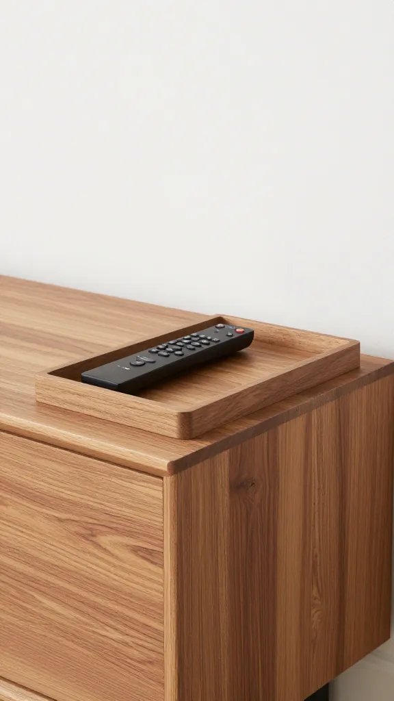
– Group your essentials: remote, game controllers, and streaming devices. Keep one small tray for clutter so it never spirals.
Color and material: the duo that sells the look
– Pick a restrained palette: think neutrals with one or two accent colors. White, charcoal, beige, and rich wood tones always feel premium.
– Mix materials thoughtfully. A matte black frame, natural wood, and a touch of glass or metal can feel intentional rather than chaotic.
– Pro tip: pick one dominant material (like wood) and two supporting textures (metal and ceramic) to create depth without overstimulation.
Balance is your best friend: symmetry without being boring
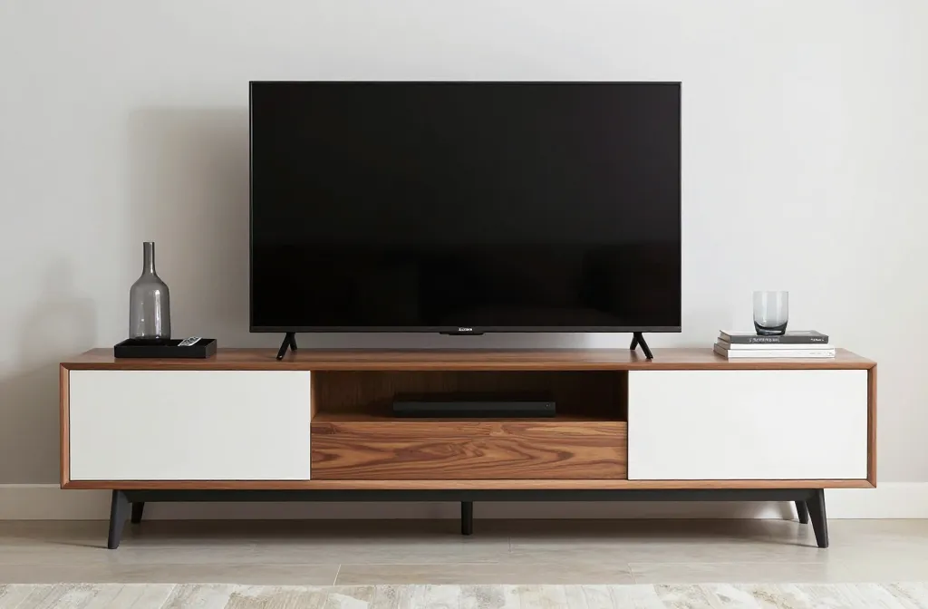
– Place the TV as the anchor, then balance with objects on either side. You don’t need a mirror-image setup; uneven weight can feel refined.
– Use vertical and horizontal elements together. A tall vase on one side and a low, wide tray on the other creates a composed silhouette.
– Avoid crowding. If you can’t see the back of the stand, you probably have too much stuff.
Rise above clutter: smart storage tricks that look luxe
– Hide the chaos: use closed storage like cabinets or decorative baskets for cables, remotes, and manuals.
– Cable management is your secret weapon. Route cords behind a cable cover or inside the back panel and keep them bundled with Velcro ties.
– Alternating storage heights adds sophistication. Try a stack of short, sleek boxes on one side and a single tall vase on the other.
Textures that scream “expensive” without shouting
– Layer textures in small doses. A woven basket, a ceramic diffuser, and a linen cloth beneath a decorative piece can elevate the look.
– Use soft touches near electronic components. A suede coaster or felt mat protects surfaces and reduces the “tech clutter” vibe.
– FYI, metallic accents (bronze, brass, or brushed nickel) catch light and read as high-end when kept to a few pieces.
Artwork, greenery, and personality: tastefully peppered
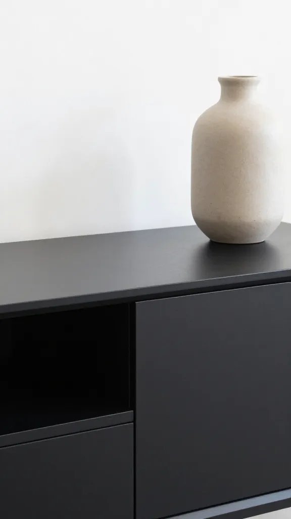
– One or two artwork pieces or framed photos can anchor the setup. Choose frames that match the stand’s hardware.
– A small plant or a vase with dried stems adds life. Avoid towering greenery that blocks sightlines to the screen.
– If you’re playing the “I want the room to feel lived-in” card, tuck in a quirky but refined object—think a minimal sculpture or a ceramic bookend—that doesn’t scream disposable.
Layering for depth: what to place in front of the TV for a polished hotel-vibe
– Start with a low-profile media console base, then layer a slim coffee-table book, a candle, or a decorative tray.
– Add a statement piece that’s not heavy in color but rich in texture—a velvet candle holder, a matte-finish metal sculpture, or a ceramic bowl.
– Keep the back row simple. If you need a second row of decor, ensure it doesn’t block the screen’s center line or feel crowded.
Practical layout ideas you can actually copy today
– Idea A: The calm balance
– Center: TV
– Left: a single tall vase + a small stack of artful books
– Right: a low tray with remotes neatly organized inside
– Idea B: The texture pairing
– Center: TV
– Left: woven basket with cables tucked inside
– Right: ceramic bowl with coasters and a slim metal lamp
– Idea C: The monochrome chic
– Center: TV
– Left: black metal sculpture + a small green plant
– Right: mirrored tray with a single white candle
H3: If you love tech, hide it smartly
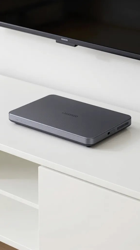
– Use a modern media console with concealed compartments for routers, streaming devices, and consoles.
– Label cables with color-coded wraps so you can easily unplug or rearrange without a tangle.
– Create a dedicated “charging station” inside the stand to keep cords tidy and out of sight.
H3: Lighting that elevates, not distracts
– A discreet LED strip behind the TV or under a lip on the stand adds a soft glow and makes the setup feel pricey.
– Avoid bright overhead lighting reflecting off the screen. Soft, warm bulbs or dimmable fixtures work best.
– If you’re into task lighting, a slim, matte lamp on one side reads as thoughtful design, not clutter.
H3: Scale, proportion, and the eye
– Match the stand width to your TV’s width. A stand that’s too narrow or too wide throws off the entire look.
– Choose decor pieces in sizes that don’t compete with the TV’s visual mass. Think one large piece and a couple of smaller accents.
Maintenance: the boring-but-crucial part
– Quick weekly wipe-downs keep dust from turning your chic setup into an eyesore.
– Rotate a few decor pieces every season. It keeps the space feeling fresh without buying new stuff.
– If something doesn’t earn its keep (a useless coaster collection, a joke figurine you never looked at), retire it.
Common pitfalls and how to dodge them
– Pitfall: Too many tiny items. Result: a cluttered, chaotic stage.
– Fix: Use 2–3 anchor pieces and 2–4 supporting accents max.
– Pitfall: All dark on dark. Result: the stand looks like a black hole.
– Fix: Add one light element (a white vase, a light wood accent) to break the darkness.
– Pitfall: Cables that threaten to escape.
– Fix: Hide them behind a back panel or under a cable cover; bind loosely and tuck.
FAQ
How do I choose colors for a TV stand that feels expensive?
Stick to a restrained palette: 2–3 colors max. Neutral walls with a bold,-but-not-too-bright accent piece usually reads as luxe. If you’re unsure, go with a warm wood tone, a cool neutral like stone or charcoal, and a single metallic accent.
Can small decor items really make a difference?
Yes. A few well-chosen pieces trump a lot of random stuff. Think one statement sculpture, one plant, and a clean tray for remotes. The goal is intentionality, not clutter.
What about shelving behind the TV for extra storage?
Floating shelves or a console with hidden compartments work wonders. They give you places to tuck cables, devices, and remote-control chaos while keeping sightlines clean.
Is symmetry always best, or can I mix it up?
Symmetry can feel high-end, but a deliberate asymmetrical arrangement can look equally chic. Just make sure there’s a cohesive thread—color, material, or height—and it won’t feel chaotic.
How can I keep the look feeling fresh without buying new stuff?
Rotate 2–3 pieces seasonally, switch in a new plant, or swap in a different tray or sculpture. Small changes yield big impact without blowing your budget.
Conclusion
You don’t need a designer’s bio, a tagged budget, or a secret showroom to make your TV stand look clean and expensive. Start with a clean slate, pick a restrained color story, and layer textures with intention. Keep cables tucked, balance height and mass, and pepper in a few character pieces. The result? A stand that looks refined, feels cohesive, and serves as a quiet focal point rather than a visual earful. FYI, the payoff is immediate: you’ll actually enjoy watching TV in a space that looks purposeful and polished.