Let’s be real: blank walls are a mood killer. The good news? You don’t need an art degree or a giant budget to make them fabulous. With a printer, a few free tools, and a dash of creativity, you can whip up DIY printable wall art that looks shockingly high-end. Ready to turn pixels into applause?
1. Start With The Vibe, Not The File
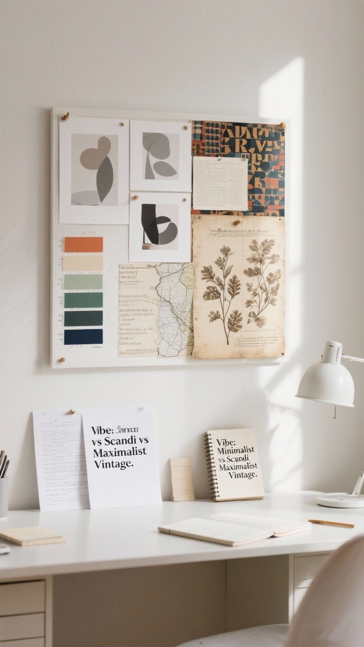
Before you open Canva or raid Pinterest, pick a vibe. Are you going for minimalist, gallery wall chic, vintage botanical, or bold color-block? The vibe drives everything: fonts, colors, and layout.
Quick Vibe Check
- Minimalist: whites, soft grays, clean lines, simple typography.
- Scandi Organic: muted tones, abstract shapes, natural textures.
- Maximalist: contrasting colors, layered patterns, oversized text.
- Vintage/Academic: sepia botanicals, antique maps, classic serif fonts.
Pro tip: Build a mood board with 6–8 images. Screenshot your favorite posters, color palettes, and fonts. Keep it tight. FYI, fewer references = faster decisions.
2. Pick The Right Tools (Free And Foolproof)
You don’t need Photoshop (unless you want it). There are plenty of free options that nail the job.
Designer-Approved Freebies
- Canva: Best for templates, typography, and quick layouts. Tons of free elements.
- Photopea: A free, browser-based Photoshop dupe for more control.
- Vectr or Figma: Great for clean vector shapes and scalable graphics.
- Unsplash/Pexels: Free high-res photos for backgrounds or overlays.
- The Noun Project: Icons galore. Perfect for minimalist sets.
Set your document size first: 8×10, 11×14, 16×20 are easy to frame. Use 300 DPI for crisp prints and export as PDF for sharp text or PNG for images.
3. Typography That Slaps (Without Trying Too Hard)
Typography art is iconic because it’s simple and powerful. The trick is balance: bold font, generous spacing, and intentional composition. Don’t cram a paragraph onto a poster—pick a word or short phrase that feels chic, not cheesy.
Fonts That Never Miss
- Serifs: Playfair Display, Libre Baskerville, Cormorant.
- Sans-Serifs: Montserrat, Poppins, Inter.
- Display: Bodoni Moda, Cinzel, Abral Fatface (sparingly).
Design moves:
- Use all-caps with wide letter spacing for museum vibes.
- Pair a bold serif headline with a tiny sans-serif subtitle.
- Try a duotone: off-black text on cream paper looks luxe.
Need inspo? Short phrases like “Less But Better,” “Stay Cozy,” or single words like “Gather” can look incredibly elevated with the right font and whitespace.
4. Abstract Shapes, Color Blocks, And Line Art
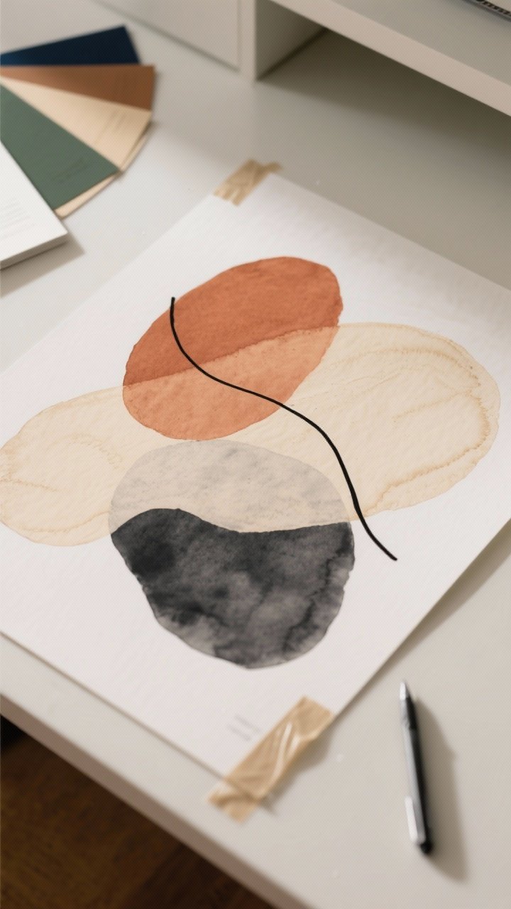
Abstract art is the ultimate low-effort, high-drama printable. Use organic blobs, intersecting lines, and tonal palettes for a designer look.
How To Build It
- Shapes: Layer irregular ovals, arches, and half-circles. Reduce opacity for overlap effects.
- Lines: Add a single continuous line over your shapes for movement.
- Texture: Overlay a subtle paper grain or watercolor texture at low opacity.
Color palettes that work: terracotta + cream + charcoal, sage + sand + oat, navy + tan + off-white. Keep it to 3–4 colors, max. IMO, less is more here.
5. Curate A Gallery Wall Like A Pro
The secret sauce is cohesion. Your prints don’t need to match, but they should talk to each other. Think: a typographic piece, an abstract, one photo, and a botanical. Boom—instant gallery.
Set Sizes And Ratios
- Anchor piece: 16×20 or 18×24.
- Supporting: two 11x14s.
- Fillers: two or three 8x10s.
Stick to a 2-inch spacing between frames. Repeat one color across all prints (even subtly) for cohesion. If you’re vibing with neutral frames, try a mix of wood and black for depth.
6. Print Like You Mean It (Paper, Ink, And Frames)
Let’s talk materials. Even a mediocre design looks elite with the right paper. Conversely, cheap paper can make great design look meh. Choose wisely.
Paper Picks
- Matte cardstock (200–250 gsm): Best overall. No glare, rich color.
- Fine art/textured paper: Adds depth; ideal for abstracts and botanicals.
- Satin photo paper: Great for photography; avoid high gloss for text.
Printing Tips
- Use “Best Quality” and set the correct paper type in your printer settings.
- Export PDF for text/vector and PNG for photos at 300 DPI.
- Try a local print shop for anything bigger than 11×14—prices are usually friendly.
Frame & Mat Hacks
- Oversized mats make prints look instantly expensive.
- Choose anti-glare acrylic if your wall gets tons of light.
- Swap out default mat colors—white or off-white is timeless and crisp.
7. Steal-This-Idea Templates You Can Make Tonight
Short on time? These concepts are fast, chic, and beginner-proof. Customize colors and sizes to match your space.
Idea 1: Minimal Serif Statement
- Canvas: 11×14, cream background.
- Text: One word (“Breathe” / “Sunday” / “Gather”), all-caps, Playfair Display.
- Add a tiny subtitle in Inter, letter-spaced, for a museum placard effect.
Idea 2: Tonal Triple Shapes
- Three stacked organic blobs in one color family (tan, latte, cocoa).
- Add a thin, black squiggle line across all three for movement.
Idea 3: Modern Botanical
- Find a free vintage botanical on a public domain site (try rawpixel’s public domain).
- Place on a soft parchment background with a thin border and Latin name in a serif font.
Idea 4: Arch & Sun
- Use a large arch shape in a muted color, then a small circle “sun.”
- Offset them slightly for that gallery-store look.
Idea 5: Photo + Quote
- Full-bleed moody landscape (Unsplash is your friend).
- Add a tiny quote at the bottom, center-aligned. Keep it subtle. No Pinterest poetry, please.
Idea 6: Map Or Coordinates
- Use a free map generator or screenshot a minimal map (zoom out, remove labels if possible).
- Underneath, add coordinates or city name in a refined serif. Very “boutique hotel.”
Idea 7: Line Portrait
- Trace a favorite profile photo in Photopea or use a simple line-art generator.
- Black line on off-white background = timeless and personal.
Final Touch: Lay your prints on the floor, arrange until it clicks, then hang with painter’s tape to test placement before committing. Your future self will thank you.
You’ve officially got the chops to create wall art that looks custom and costs next to nothing. Print a few, swap them seasonally, and tweak your color palette as your style evolves. Go make those walls the main character—because blank space is so last year.