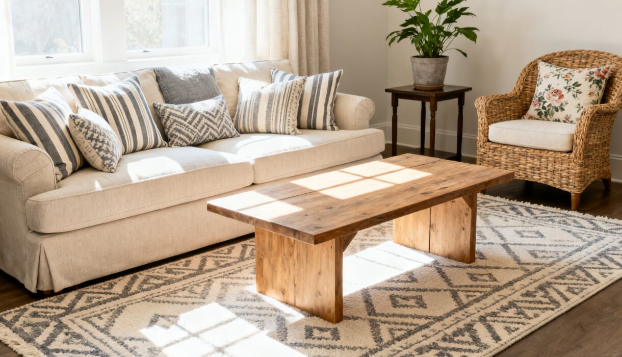

Pattern mixing can look like effortless magic—or a headache you can’t unsee. The difference? A few smart rules and a little confidence.
You don’t need an interior design degree to pull it off; you just need a plan. Let’s turn that pattern party from chaotic to chic, without the visual hangover.
For more budget styling ideas, see How to Choose Throw Pillows That Look Expensive, Budget Wall Styling Ideas for Any Room That Instantly Look Designer, and 10 Budget Home Decor Ideas That Look Expensive: Luxe on a Budget.
Start With a Color Story
You can mix any patterns you want if the colors get along. Pick a simple palette: 2-3 main colors plus a neutral.
That palette acts like a referee when patterns start to argue. How to build your palette fast:
- Choose one “hero” item (a rug, curtains, or headboard) and pull 2-3 colors from it.
- Add a grounding neutral: white, cream, gray, black, tan—whatever fits your vibe.
- Repeat your main colors at least three times around the room for cohesion.
Pro Tip: Vary the temperature
Warm + cool tones together feel balanced. If your main colors skew warm (terracotta, mustard), toss in a cool accent (sage, navy) so it doesn’t feel flat.
Mix Scale Like a Pro (This Is the Secret Sauce)
Patterns clash when they shout at the same volume. Size them smartly so each reads clearly.
Think of it like a band: you need a lead singer, backup vocals, and a solid bass line. A fail-proof trio:
- Large-scale pattern: Big florals, wide stripes, oversized geometrics. Use on rugs, curtains, or large art.
- Medium-scale pattern: Smaller geometrics, tighter florals, batik prints. Use on pillows or a chair.
- Small-scale pattern: Tiny dots, pinstripes, micro-checks.
Use on throws, accent pillows, lampshades.
Balance across the room
Don’t stack all your large patterns on one side. Spread them so your eye ping-pongs around the room in a good way—not like it just chugged espresso.
Choose Pattern Types That Complement, Not Compete
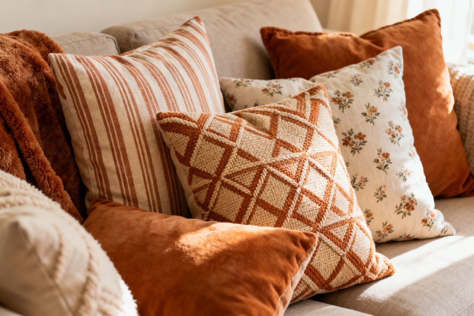
Too many of the same vibe can feel… same-y. Mix structured prints with organic ones so the room feels alive. Easy combinations that always work:
- Floral + Stripe: Classic yin-yang.
The straight lines calm the curves.
- Plaid + Botanical: Cozy meets fresh. Add a solid velvet cushion and it’s chef’s kiss.
- Geometric + Abstract: Keep one crisp and one looser for contrast.
- Animal print as a neutral: FYI, leopard counts as a neutral in design land. Use it sparingly and it plays nice with almost anything.
When in doubt, add texture
If your patterns start to feel loud, bring in texture-only “patterns”: linen slub, bouclé, seagrass, wood grain.
They count as visual interest without adding print chaos.
Anchor With Solids (Yes, You Need Breathing Room)
Solids give your eye a place to rest. Without them, even great pattern mixes look like a Where’s Waldo spread. Where to add solids:
- Sofa or bedding base in a neutral or one of your palette colors
- Throw blankets, lamp shades, and drapery trims
- Wall color that supports the palette instead of fighting it
The 60-30-10 approach
Aim for roughly 60% solids, 30% patterns, and 10% accents that can be either. Not a rule, but IMO it keeps things calm without getting boring.
Repeat, Repeat, Repeat (But Not Copy-Paste)
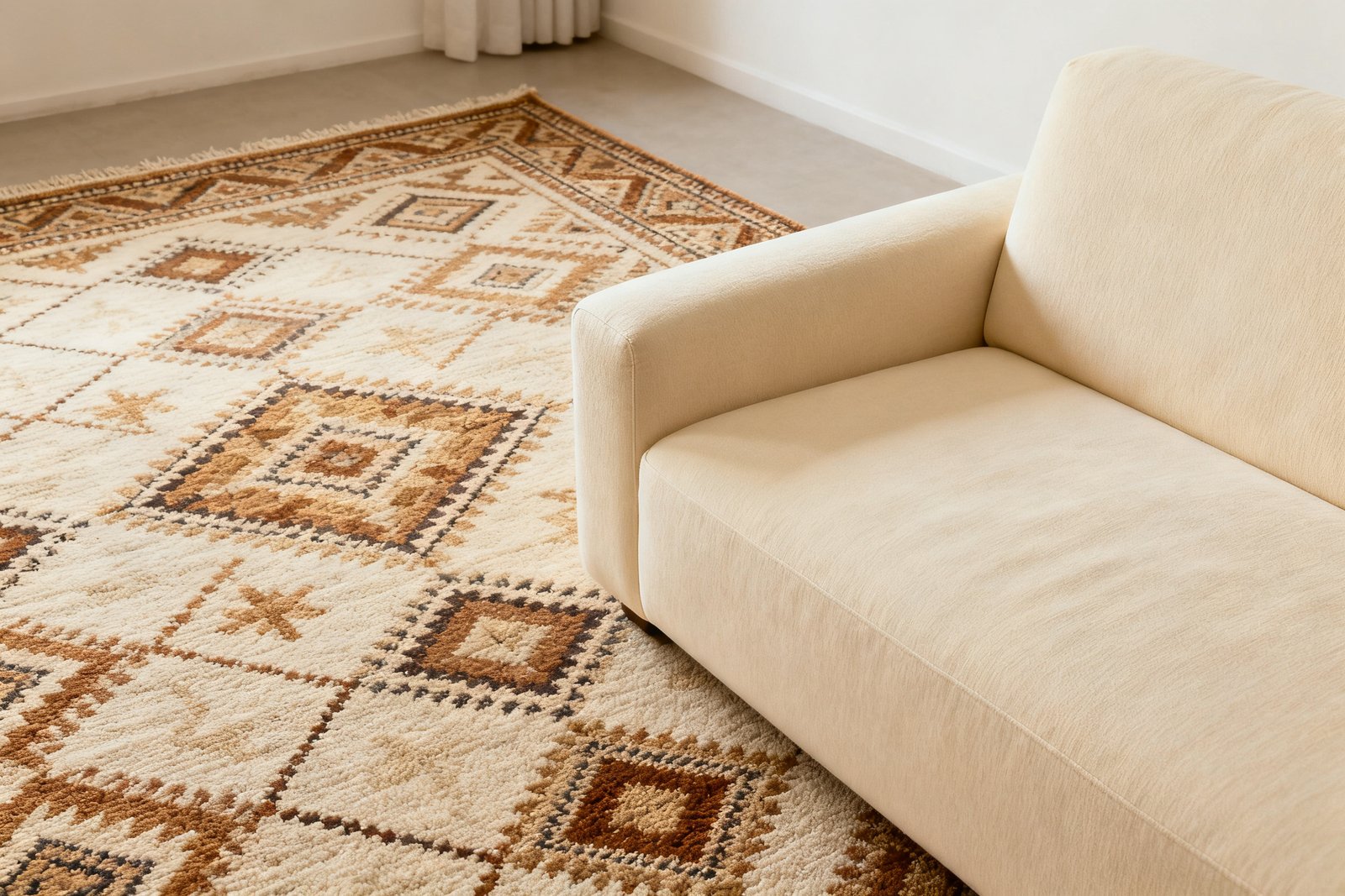
Repetition ties things together, but you don’t need to clone patterns.
Echo the same color or motif in different ways to feel intentional. Simple repetition ideas:
- Bring a navy stripe from the rug into a pillow trim or artwork.
- Echo a curved floral in a scalloped lampshade or arched mirror.
- Match the warm tan from a plaid throw to leather straps or wood tones.
The rule of threes
If a color or motif appears at least three times, your brain tags it as “on purpose.” Magic.
Refreshing a room and feeling stuck on where to start? Try the free 5-Day Budget Home Reset →
Use Contrast to Prevent Visual Mush
If everything has the same contrast, it blends into one big meh. Mix light and dark moments to sculpt the space. How to add contrast without chaos:
- Pair high-contrast patterns (black/white stripe) with low-contrast ones (tone-on-tone damask).
- Let one pattern steal the show; keep the others quieter in value or color.
- Separate busy prints with a solid cushion or wood arm to create boundaries.
Edit Like a Stylist
You don’t need every cute pillow from the store. Style the space, then take one thing away and reassess.
If you hesitate, snap a photo—your phone exposes clutter instantly. Weird but true. Rapid-fire editing checklist:
- Does each pattern have a job? If not, cut it.
- Do you have varied scales?
If not, swap something.
- Are your colors repeating? If not, add a small accent that bridges gaps.
- Is there enough solid/texture to rest the eye? If not, introduce a plain throw or neutral shade.
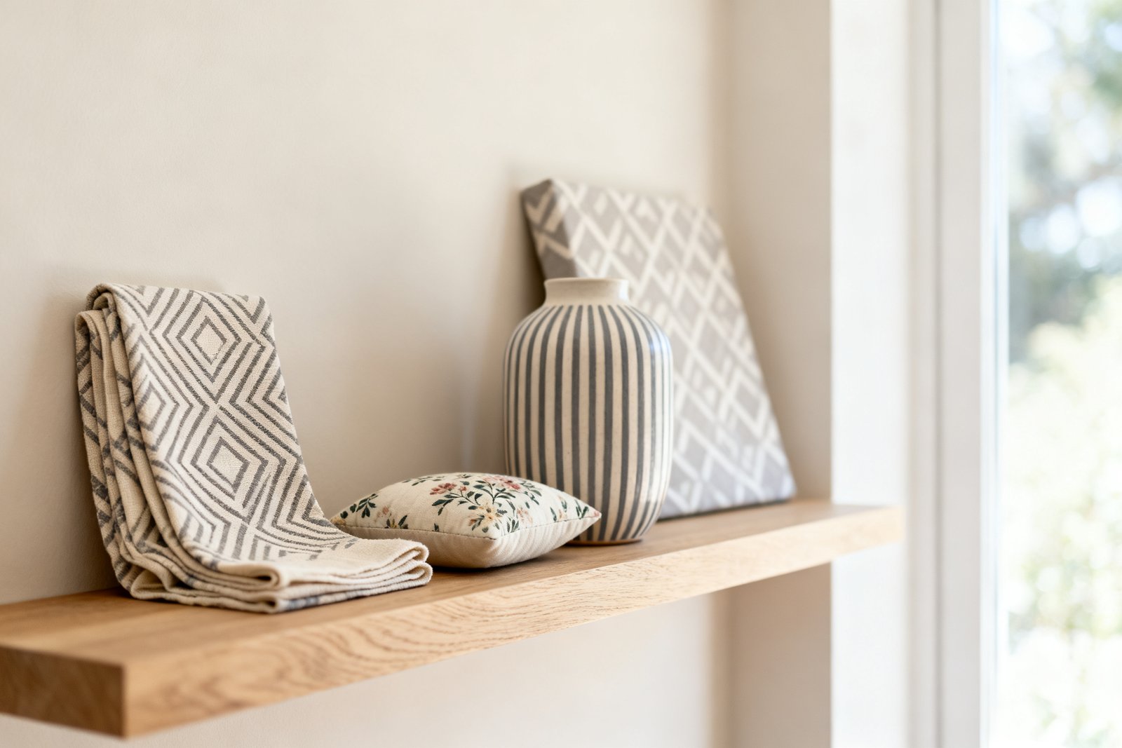
Room-by-Room Quick Plays
Living room
Start with a patterned rug (large-scale), add a solid sofa, layer in medium-scale pillows, then finish with a tiny pattern throw or ottoman.
If you’ve got curtains, let them be either patterned or solid—not both the rug and curtains shouting.
Bedroom
Patterned duvet or quilt as the star, solids on sheets and bed skirt, and two sets of pillows: one medium, one small-scale. Add texture on the headboard or bench to calm it all down.
Dining
Patterned chairs or a runner, not both. If your wallpaper sings, keep the table linens simple and echo the wallpaper colors in art or ceramics.
FAQ
How many patterns can I mix before it looks busy?
You can mix 3-5 patterns easily if you vary scale, repeat colors, and anchor with solids.
Go beyond that only if you love maximalism and you edit ruthlessly. The number isn’t the problem—lack of structure is.
Can I mix different stripes or plaids together?
Yes, but vary scale and direction. Pair a bold, wide stripe with a thin pinstripe.
For plaids, combine one clean tartan with a looser windowpane, and keep them in the same palette so they relate.
What if my rug is already loud?
Great—treat it as the hero. Pull 2-3 colors from it, choose a solid sofa, and add smaller prints that echo those rug colors. Use texture on big items (linen drapes, wood coffee table) to dial down the noise.
Do neutrals count as patterns?
Absolutely—if they have pattern or texture.
A beige herringbone, a cream boucle, or a subtle taupe stripe still reads as pattern. They’re your stealth ninjas for interest without chaos.
Is wallpaper plus patterned curtains too much?
Not if you balance scale and contrast. Go big on the wallpaper, then choose a low-contrast, small-scale print or a solid for curtains.
Add a trim that repeats a wallpaper color for a tidy bow.
How do I fix a room that already feels busy?
Remove two items and reassess. Add a couple of solids, reduce one pattern’s scale, and repeat a key color in small accents. If nothing helps, your palette might be the culprit—simplify it to two mains plus a neutral.
Conclusion
Pattern mixing doesn’t require bravery so much as a game plan.
Pick a tight color story, vary your scales, and let solids and textures be the chill friends who keep the party under control. Edit once, then edit again. IMO, that’s how you go from chaotic collage to collected cool—no headache meds required.